Michaela Rodwick, Jason Leimgruber, Kevin Redman, Maren Costa
My Role
Design Lead
Business Impact
A design that has lasted the company more than 10 years.
A major upgrade to the overall Amazon brand
Mobile first web experience unlocked more sales volume
New navigation improved pathfinding for customers
What I did
UX Design
Visual Design
Interaction Design
Product Strategy
Information Architecture
M
Overview
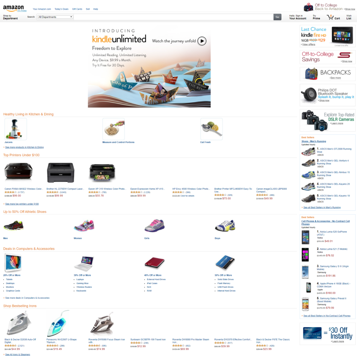
I was part of a team at Amazon tasked with redesigning the home page of amazon.com. Jeff Bezos described the design before ours as “grandpa’s junk drawer”, and he wasn’t wrong. Interestingly, this stands out as a primary case between data driven and data informed design. Every pixel of the old site was data driven, and performed well, but overall the design and qualitative experience was very poor. The home page looked terrible, and the experience wasn't good for customers as a result. Data had driven us into a corner. We prioritized simplicity and letting the products speak for themselves. Many of the design decisions we made in 2015 still exist to this day.
The Old Homepage
Data driven, not informed. Every pixel above the fold was tied to millions in revenue. None of the departments who owned those pixels wanted to change something that performed. The issue was it's filled with awkward white space, ads, and text everywhere, it didn’t meet the mark for customers. For a customer obsessed company, this was unacceptable.
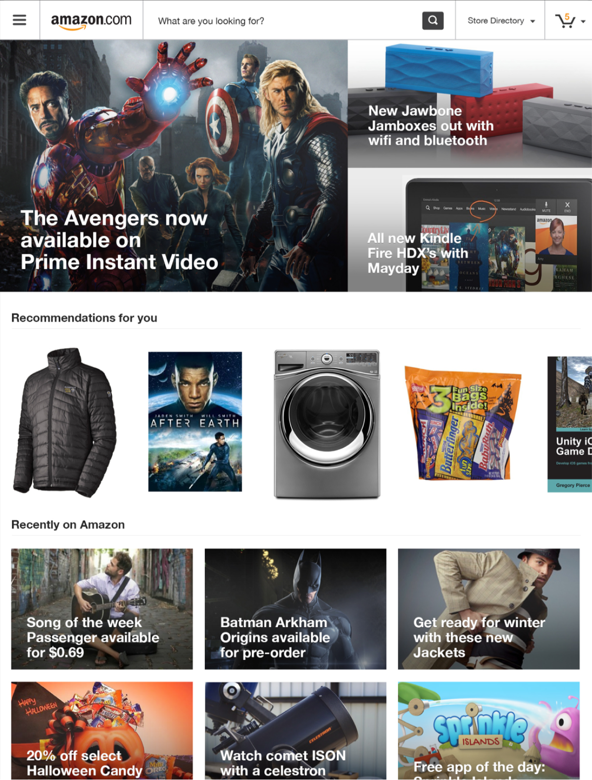
Focus on Product
We changed the relationship products had on the page by making them bigger, more central, and aligned on compelling grids. We also removed a lot of the text in most cases to make things look cleaner.
Category Cards
We brought more relevant category and sub category cards to the forefront for customers who were interested in browsing vs. specific purchases.
Higher Impact
We wanted customers to have more product options at a glance. So, we created more striking sections. They had relevant, personalized product images.

.png)