Customers could evaluate products 50% more efficiently
Customers had interactive access to their item lists, increasing satisfaction
Resulted in a US Patent for novel interaction design for Amazon
What I did
UX Design
Visual & Interaction Design
A/B Testing
Research & Prototyping
M
Overview
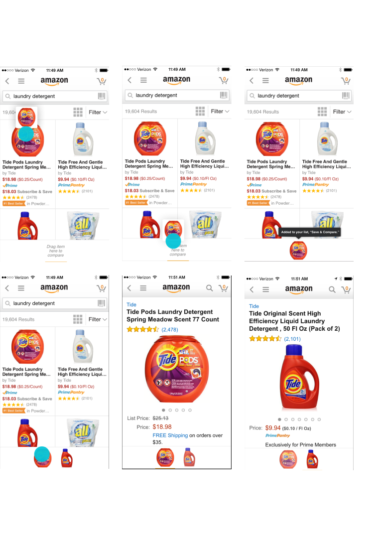
A common pattern in shopping is ping-ponging from one detail page to another to compare items. On desktop, customers bring up screens side by side to compare. We built a feature that lets you collect items of interest in a list and compare them right from search results. Customers could tap on each item they had in their item drawer at the bottom of the screen.
Collect & Compare
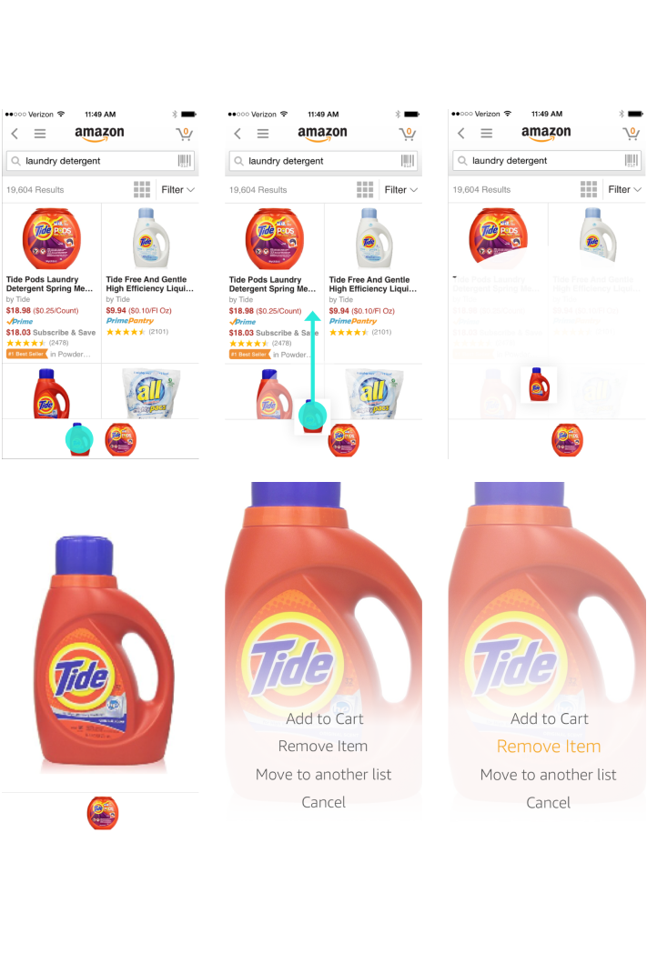
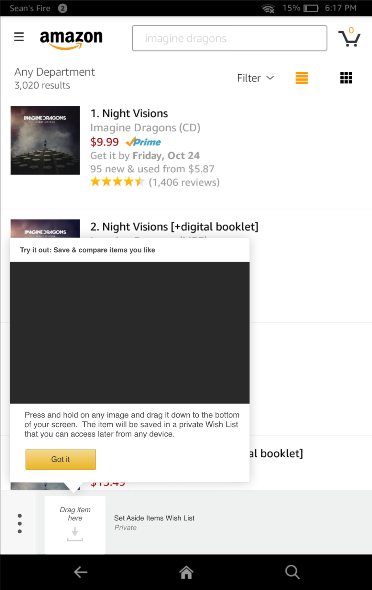
Customers long press on any item they see and then drag it to the bottom of the screen. It let’s you know which list you’ve added the item to.
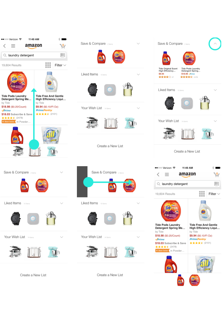
List View
Allowing customers to manage their lists from the product shelf was important. Customers need to be able to shop for different things at once. I designed a swipe up gesture which would reveal a list view.
Decision Making
It should be easy to make a decision while shopping on your phone; I designed a single movement pattern to make the process effortless.
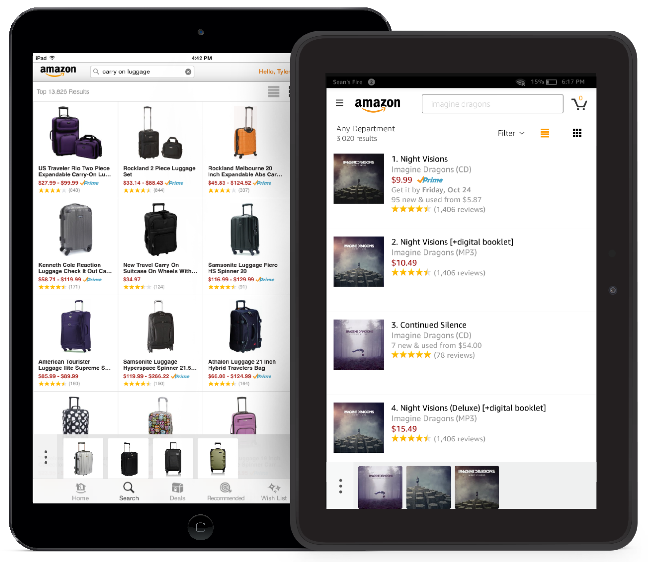
On Tablets Too
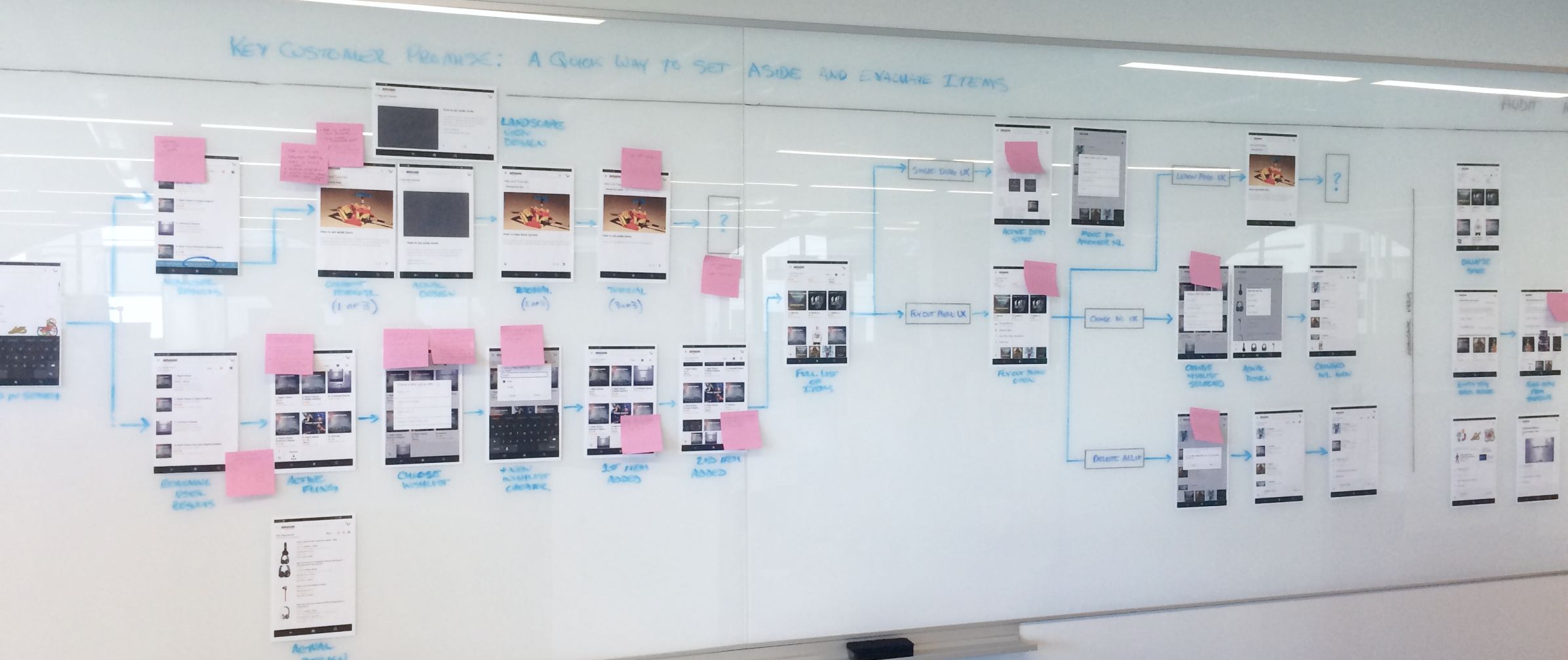
We originally built Item Compare on the Tablet. We went through a series of versions after release.
Improved Discovery
Discoverability was an issue, and it's hard to describe in words how to gesture. Originally Amazon had this terrible black screen takeover which accosted users right after performing a search. Customers hated it, and it immediately soured their willingness to try a new interactive feature. 9 out of 10 users in testing dismissed the tutorial and never found the feature.
This was a big problem, so I put together a plan to create a new, less obtrusive discovery experience that didn't exist on Amazon tablets.
We all have mirror neurons in our brain that help us copy a behavior we see.
That's why video tutorials showing someone doing the action is 10x better than us trying describe what to do. That's why Apple uses them.
I got buy in to hire a camera crew, and I literally got to direct the video myself that got added to a popup UI I designed for the tablet, which showed users how to use Fling. This turned out to be way more effective at introducing a difficult to find feature to customers.
Some Process
Item Compare was a fun feature to work on and went through many iterations and versions. The engineering team and I would sit at the wall and work together to poke as many holes in it as possible.